
UX Best Practices for Site Search
Sep. 23, 2024
JF Boisvert
|
How satisfied are you with the search experience on your website? More importantly, how satisfied are your customers?
Forrester Research shows that 43% of website visitors immediately navigate to the search bar, and searchers are 2-3x more likely to convert compared to non-searchers. In fact, by optimizing your search experience, you could boost conversions by up to 30%. These statistics highlight that a significant portion of your audience depends on site search to find exactly what they need.
Every site search improvement, no matter how seemingly small, can have a major impact on your visitors’ overall website experience. Something as simple as visual consistency or fast search results can be the difference between a loyal customer and a former customer.
Here’s how to maximize your site search UX success. This article will unlock the secrets to help you first gain a deeper understanding of how visitors interact with search on your site and then provide some best practices and important hints.
What is Site Search UX?
From a website visitor standpoint site search gives website visitors the ability to quickly solve their problem or answer a specific question. From a Digital Marketer’s perspective, site search UX relates to how well an onsite search experience works for the visitor by measuring key performance indicators (KPIs).
How to Measure Site Search UX Success?
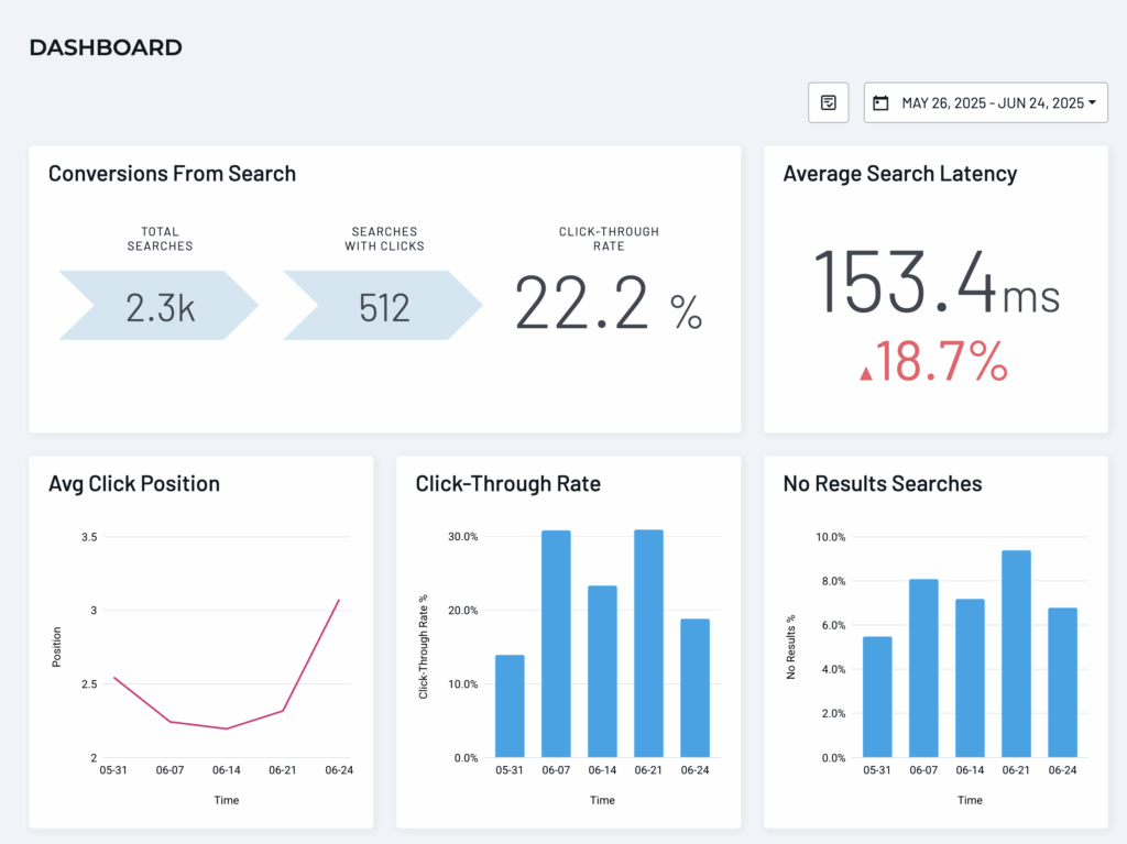
Measuring the success of site search involves tracking key metrics that assess both user engagement and the performance of your search feature. Here are the most important KPIs and approaches to measure your site search effectiveness:
1. Search Click-Through Rate (CTR)
CTR measures how often users click on search results after entering a query. A higher CTR indicates that users are finding relevant results quickly. Low CTR suggests that results are likely not meeting user expectations.
- How to calculate: (Number of clicks on search results / Total number of searches) x 100
- Insight: A good CTR is generally around 30-40%, but this depends on the website and industry.
2. Search Conversion Rate
Search Conversion Rate measures how effectively site searches lead to desired user actions, such as reading content, signing up or making a purchase decision. For information-rich websites, searchers often convert at 2-3x higher rates than non-searchers, highlighting the importance of relevant and user-friendly search functionality. This metric helps gauge the overall success of your site’s search system in driving valuable outcomes.
- How to Calculate: (Conversions from search / Total number of searches) x 100
- Insight: A high Search Conversion Rate alongside a strong Search CTR signals that users are not only clicking on relevant search results but also completing meaningful actions. If the Search Conversion Rate is lower despite high clicks, it indicates a disconnect between search results and post-click experiences. To improve, focus on optimizing the relevance of landing pages and refining the user journey after the search interaction.
3. No-Result Searches
No-Result Searches happen when the search engine returns no results for a user’s query. High instances of no-result searches signal gaps in content or poor indexing, leading to frustration and higher bounce rates.
- How to calculate: Percent of total searches that delivered no result. (# no result / Total number of searches) / 100.
- How to improve: Reduce no-result searches by regularly analyzing them and adding content, tags or synonyms to capture similar queries. Reducing these by 5% can increase user satisfaction by 20%.
- Insight: The lower the better. Curious how you stack up to others in your industry? We can share some anonymized averages, let’s talk.
4. Searches per Session
This metric tracks the number of searches a user performs during a single visit to your site. A higher number could indicate users are struggling to find relevant results on their first attempt, or it could reflect a highly engaged user exploring various topics. To interpret this effectively, analyze it alongside CTR and No-Result Searches.
- How to analyze: If searches per session are high but CTR is low, it likely suggests that users are not finding useful results. This points to the need to improve search relevance, adjust filters or enhance autocomplete functionality. Ideally, users should find what they need within 1-2 searches per session for optimal satisfaction and efficiency.
- Insight: A high number of searches per session, combined with a low CTR, signals issues with search relevance or filtering. Improving these areas can reduce user frustration and increase engagement. Users should ideally complete their search objectives within 1-2 searches to ensure a smooth, efficient experience.
5. Average Click Position
This measures how far down your search results page users have to go before clicking. Ideally, clicks should occur within the top 3 positions. If users are clicking on results farther down, it may indicate that more relevant results are being pushed lower on the page.
- How to analyze: Aim to keep the Average Click Position within the top 3-5 results for optimal engagement.
- Insight: Track average click positions month-over-month averages and for specific high-value keywords. Just like your Google rankings, you want to see your best content move to the top of your website search results page. But unlike Google, you should be able to curate and control what lands up top – it is your website search, after all.
6. Searches Without Clicks
This metric tracks how often users search but do not engage with any results. A high rate of searches without clicks suggests users aren’t finding relevant information, leading to frustration and disengagement. This could stem from irrelevant content, poor search result ranking, or unhelpful results cards.
- How to Analyze: Regularly review the percentage of searches without clicks. If this number is elevated, it points to issues with search configuration, content quality, or results card. Improving these areas can better align search results with user intent and drive engagement.
- Insight: A high volume of searches without clicks highlights gaps in result relevance or presentation. Address this by refining synonyms, enhancing content and improving the clarity of results cards, leading to better engagement and a smoother user experience.
7. Top Searches
Tracking Top Searches reveals which keywords or phrases are most frequently used by your visitors. This insight helps identify key interests, popular products or important content. By analyzing the most common search terms, you can ensure these items are easy to find, optimize your content around them, and even predict trends or demand shifts.
- How to analyze: Monitor the top search queries and check whether the corresponding results are driving high click-through rates or conversions. If top searches lead to No-Result Searches or low engagement, it may indicate a gap in your content or products, suggesting the need for updates or new additions to meet user demand.
- Insight: Check popular search trends during various seasons throughout the year and prepare your content and social media strategy accordingly.
8. User Satisfaction Surveys
Beyond quantitative data, asking users directly about their search experience can provide actionable insights. Questions such as “Did you find what you were looking for?” or “How satisfied are you with the search results?” help gauge the overall success of the search experience.
By continuously tracking and optimizing these metrics, you can ensure that your site search delivers value, improves user experience and drives conversions.
Getting this data is just a matter of clicks with SearchStax Site Search. It’s much harder without SearchStax, but not impossible. Let us know if you’d like some help.
What Search UX Best Practices Will Yield Better Results?
When a user decides to run a search on your website, they generally expect the following:
1. A fast and functional search experience
2. Well-organized, clean results page
3. Quick, ungated access to your site’s content
4. Ability to filter in order to narrow search results
5. Hit highlighting to guide the eye and easily scan for most relevant results
6. Intuitive search experiences, including suggested popular search terms
7. Automatically correct misspellings, we all run into spelling issues sometimes and can use related search recommendations in the search results
8. A digestible amount of search results and pagination to access more results
And most importantly, relevant results at the top of the search results page.
Search UX Optimization Examples
Consider these two examples:
In example A, a first-time visitor searches “apply” on a university website. This is a crucial search term for a school as this student is seeking admissions information. They’re likely making important decisions about their future education and there’s a good chance they’re a prospective student.
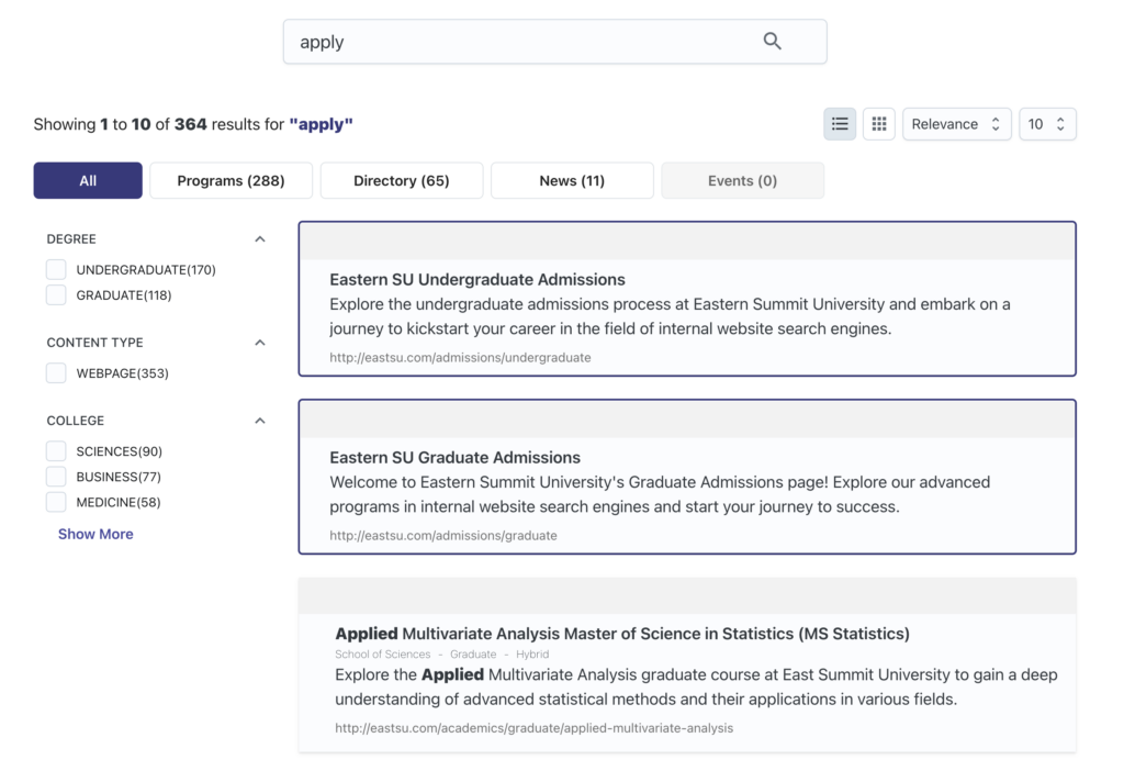
With this search, the prospective student is able to find admissions content through pages that the university has deemed most important for that search term, which they’ve promoted. The student can now bookmark the page they click into, download or request more information and share the page with their parents, who are often key in the decision making process for young students.
Site search has served its purpose and connected the student with exactly what they’re looking for. Delivering a positive search experience is so important for higher education website best practices, as well for other industries with content-rich websites, like healthcare, government, finance and more.
In example B, a first-time visitor searches “dentistry” on a university website. This is a more specialized search than the previous search for admissions content. That said, it’s a program that many higher ed institutions offer, so it’s likely a relatively common search term.
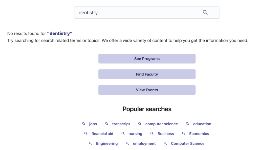
If the university doesn’t offer the program, they can offer other on-page resources to optimize their no results page. As you can see in the example, this site encourages the person to search another related term or topic, offers large buttons to lead to commonly viewed resources and even surfaces popular searches, so that the visitor isn’t hitting a complete dead end.
Not pictured, if you see a search term like ‘dentistry’ consistently get traction, you can also set up a synonym for a closely related healthcare program, such as “Health Sciences”. That way, each future time ‘dentistry’ is searched, all of your Health Sciences content will return results and you can track if the content resonates if there are clicks.
Site search should create a path of least resistance for finding exactly what your visitors need and offer other avenues of discovery when searches yield no results due to a content gap.
Visitor/customer satisfaction is directly impacted by the efficacy of your search experience; their entire perception of your website can be changed for the better if your site search consistently delivers a great experience.
Influence on Conversion Rates and Engagement
If you’re like many marketers, you’ve put serious effort into creating all types of digital content. It takes effort to ensure that users can locate those resources.
The ideal scenario is a potential customer using the search bar, coming across the content they desire and filling out a form. If your site search UX is optimized to surface key pages with these valuable resources, this scenario will happen consistently, leading to higher conversion rates, and ultimately, more sales.
Effect on Site Retention and Visitor/Customer Loyalty
Every interaction with an organization matters to the customer journey. Each interaction, both on a micro and macro scale, impacts the customer journey and molds brand perception.
With site search, every detail matters. From the speed of the search, to the continuity of the aesthetics, to search refinement features like facets and filters (more on these below), every part of the search experience has an effect on your visitors. If any part of your site search fails to connect people with the content they need, your entire website experience is in jeopardy, which could result in weaker visitor retention, trust and loyalty.
Enter your business email address to download the
UX Best Practices for Site Search
To help you out with your search improvements, we’ve created a downloadable cheat sheet with the 14 best practices to improve site search on your website.
Best Practices for Optimizing Site Search UX
With all the benefits that come from an effective onsite search experience, it’s critical to make every possible adjustment to optimize your engagement. Here are the most important site search best practices to follow:
1. Site Search Enhancements
Your site search needs to be accurate. This involves taking a holistic approach to the different obstacles standing in the way of a site search delivering results a user asks for. In order to provide visitors with relevant results, you need to have a system that can fill in the blanks and urge users to find what they’re looking for (even if they don’t type up the perfect search every time).
For example, if a user makes a typo, will your search results still offer up the potential solutions they were searching for? Will the user hit a results roadblock if they misspell a word in their search?
Think about industries like healthcare where medical terms are often complicated and not used in everyday life.When visitors inevitably misspell less common words or names of services, your site search needs to be equipped to deliver useful results. This is especially relevant in risk averse industries like this, where information accuracy is paramount.
In order to ensure that all search queries are handled properly, it’s important to implement a dedicated site search solution that has features such as relevance modeling, synonym entry and spell check options.
Relevance modeling, as below, gives you the option to change the behavior of each search completed on your site. It allows you to set parameters regarding which types of results will appear for different keywords based on their relevance level; this ensures that you’re delivering content across your search results page that resonates with visitor intent. It also ensures that the top of the search results page will have the most accurate items.
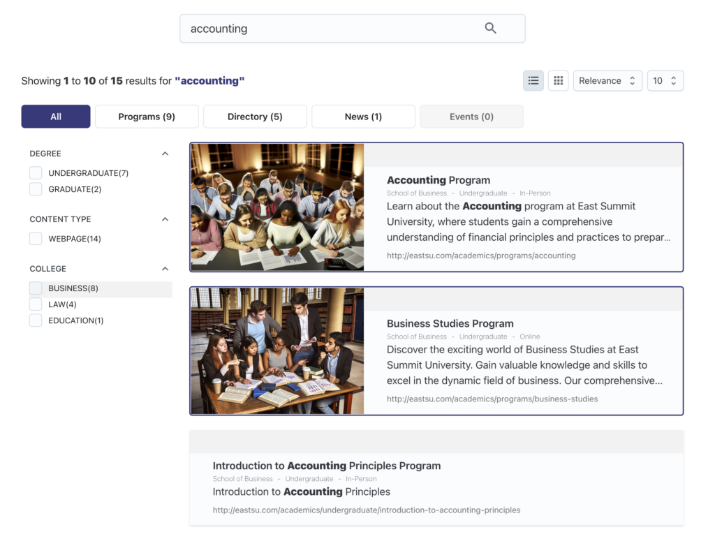
Promotions allow you to select specific content pieces to show up at the top of results pages. This allows you to execute a content strategy that pulls highlighted pages to the top of your results based on timeliness (for seasonal content) or for high intent keywords.
This allows marketers to have the agility to easily surface their best content for their most important searches. In the examples below, you can see the promoted content a university chose to surface at the top of their “accounting” search results page; it’s the content they’ve deemed most useful to one of their common program searches.
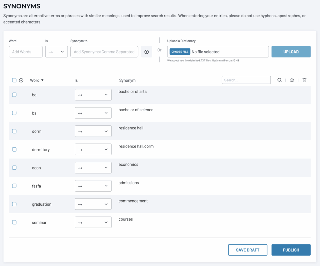
Synonyms increase the efficacy of each site search by matching search terms to the content that the user intended, even if the search wasn’t explicit in its text. For example, a search for USA should give results that include ‘United States of America’.
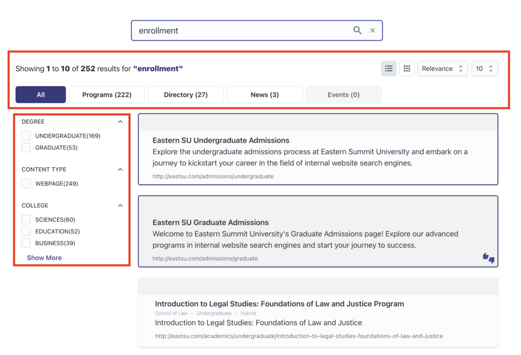
Filters and Facets are key aspects of enhancing site search through sorting and filtering options. When a user issues a search, they’ll typically want some semblance of control in the layout and sorting of the results. A filter allows this, giving them a way to sort their results by categories such as content type, date and relevance.
Facets, which are also known as smart filters, allow visitors to quickly narrow down search results by multiple dimensions at once. Filters and facets are outlined in red in the results page example below:
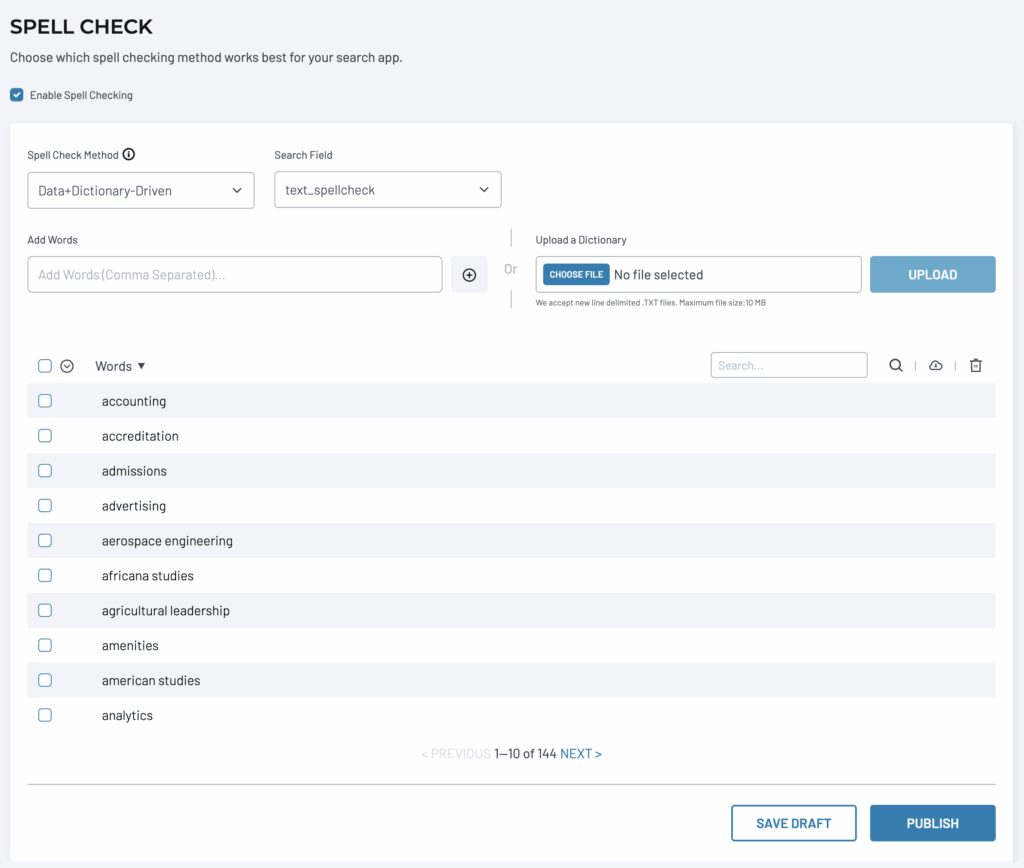
Spell Check is a feature that maximizes site search by steering misspelled words in a search toward its intended location. Visitors move fast and will not always be accurate with what they type into your search bar. Being prepared for commonly misspelled search terms will maintain an undisrupted user experience.
Other Visual Elements of UX include hit highlighting to make search terms and synonyms standout in results cards, relevant images and snippets (like meta descriptions for Google SERPs) that help the visitor quickly find and understand what a content page offers.
2. Layout
When considering your search bar’s placement, put yourself in your visitor’s shoes. If they were to decide to search for something, what would be the most likely place they would look? For most websites, the top of the page makes the most sense. This gives them an easier path to find the content they want immediately and doesn’t interfere with any of the other elements elsewhere on the page.
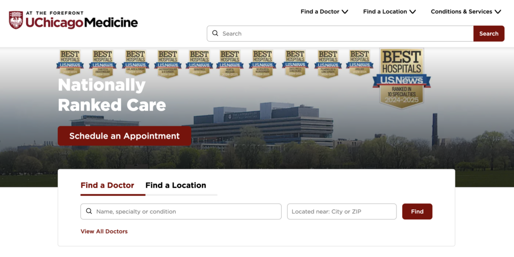
In other cases, organizations may have the need for search based functions that are named and prominent features of their service. For example, healthcare organizations often have some form of “find a location” and “find a doctor” features on their site. Those are built with site search and those experiences need to be obviously placed and tuned to deliver exceptional results.
Take the University of Chicago Medicine who built their search functionality with SearchStax as an example. They have their global search bar near the top of their homepage along with location and doctor options directly above that, as well as a featured search bar for those services below. They’d clearly rather have you search exactly what you need than use any other form of navigation.
3. Visual Design
Design considerations should always include key elements like brand consistency, accessibility and target demographics.
When building and implementing the site search experience, for both the search bar, the results and the “no results” pages, it’s important that the visuals stay consistent from start to finish. Furthermore, the design of the results cards can greatly influence conversions. Adding a thumbnail image, generated with an AI image generator, for example, will help the user understand the context of the result.
Having a clear title for the result as well as a succinct description will inform the user and allow them to make a quicker decision on whether this content is relevant to their question or inquiry.
The design should also be uniform across all possible devices, including mobile.
4. Auto Suggestions
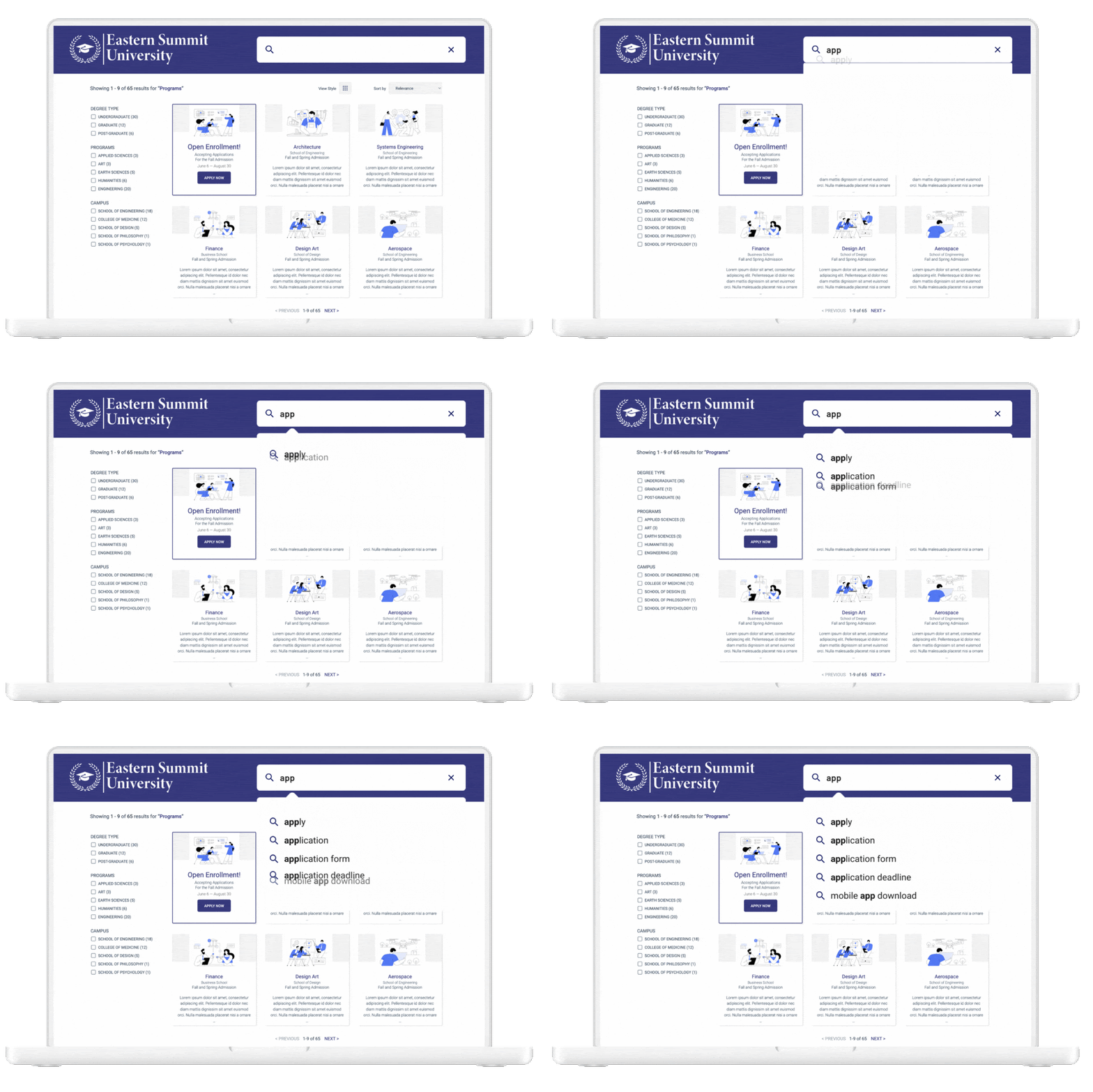
A great site search experience should offer plenty of features that maximize search efficiency. Chief among those features is the auto-suggests, or “auto suggestions feature located in the search bar. This widget helps visitors get to commonly searched terms even from the first couple of letters they type.
This feature not only helps your visitors discover content faster, but also helps reduce errors they may have encountered in spelling the word correctly if they were left to typing on their own.
Site Search UX Starts Here
Site search UX is fueled by crafting a unique, efficient site search experience that helps site visitors locate exactly what they need quickly and seamlessly, so they keep coming back to your site for a positive experience.
If you need an out-of-the-box solution that provides everything you need to level up your website’s search experience, check out SearchStax Site Search.
By JF Boisvert
Director, Product Design and UX
“…search should not only be for those organizations with massive search budgets.”
Get Our Newsletter
The Stack is delivered bi-monthly with industry trends, insights, products and more


